Sidebar
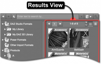
Results View
The Results View displays the items filtered by the selected container/category in the Container View and optionally the keyword(s) entered into the Search Field. Double-clicking an Asset icon will add (or apply) it to the scene.
The Results View in the Content Library pane is very similar to the Results View (General) in the Smart Content pane in the way that the individual assets are displayed and decorated. One of the more significant differences between the two, however, is that the Content Library pane is designed to search and the Smart Content pane is designed to filter.
Searching operates on the premise that, given an empty list, items that match a specified criteria are added to the list.
Filtering operates on the premise that, given a complete list, items that do not match a specified criteria are removed from the list.
Asset View
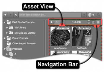 The Asset View displays each individual Asset that may cause a new object to be loaded into the scene, modify an object that is already in the scene, or trigger various other actions. When a container is selected in the associated Container View, the Asset View displays the assets assigned to that specific container.
- Information about each asset can be found on the Information Panel Info page when an asset is selected.
- Hovering the cursor over an asset icon causes a Tool Tip with a larger color version of the icon to display.
- Double-clicking an icon will cause the asset to load into a scene.
Navigation Bar
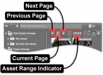
Page Navigation
- Previous Page : select the Previous Page button to return to the previous page
- Current Page : select the Current Page button to return to the current page selection
- Next Page : select the Next Page button to go to the next page in the selection
Range Indicator
The Range Indicator displays how many assets meet a specific criteria. For instance, if the selected category has nine results in it, the indicator would display 1–9. Similarly, if a keyword were then entered into the Filter Field, and only four of the results had that keyword associated with them, 1–4 would be displayed instead.
When a different category is selected, the range changes to display how many assets are associated with that specific category—the same applies to changing which keyword is entered into the Filter Field. If no results meet the current criteria, or no criteria has been defined—i.e., no category is selected—the indicator will display 0–0.
Increase Assets Per Page
The Increase Assets Per Page option raises the number of assets that are displayed on each page.
Decrease Assets Per Page
Asset Icon View
The Asset Icon View button provides the option to change the view to display the assets as icons in a grid.
Asset List View
The Asset List View button provides the option to change the view to display the assets in a list.
Results
The Results View displays the results of what is selected and searched for in the Container View. For example, while in the Container View if “G > Genesis 3 Starter Essentials” is selected in the “Products” container, the results displayed are the assets associated with the “Genesis 3 Starter Essentials” product in the database. The results are displayed as icons. Asset icons are square, while product icons are rectangular. A result may return as a product in the Results View if the product has not yet been installed.
Icon
Each item displays an image, referred to as its Icon, to aide in visually distinguishing one item from another. These icons are typically in PNG (Portable Network Graphics) format. An item lacking an icon displays a Notice indicator in place of an icon.
Asset icons are named identically to the file that the asset represents, with the exception of the file extension, and reside in the same folder on disk as the file. For an asset named Example.duf, its icon would be named Example.png or Example.duf.png. If the name of the icon does not include the extension of the corresponding file in its name (i.e., Example.png), that icon will be displayed for the assets of any files in the path that do not have icons with names that do include their respective extensions (i.e, Example.dsa). However, if the name of the icon does include the extension of the corresponding file in its name (i.e, Example.dsa.png), the asset for that file will use that icon.
Optionally, assets posses the ability to display an alternate icon in its Tool Tip when the cursor is hovered over the asset. If the file for an asset named Example.duf also has an icon named Example.tip.png, the tip icon will be displayed instead of the standard icon.
Indicators
Each asset has the ability to display additional decorations on its icon to signify what kind of asset it is, offer a hint about its loading behavior, how it might be used, and/or membership in a group. Indicators are typically represented in the form of labels and/or glyphs that overlay the corners of the icon.
Notice
If an icon for an asset is missing, a triangle with an exclamation point (“!”) surrounded by a frame appears and signals that the image for that asset's icon could not be found on disk. This notice appears in the center of where the icon would normally be. When the file for an asset is missing, a notice will appear in the lower left corner of where the icon would normally be. In the event that both the icon and the file are missing, both notices will appear.
Companion File
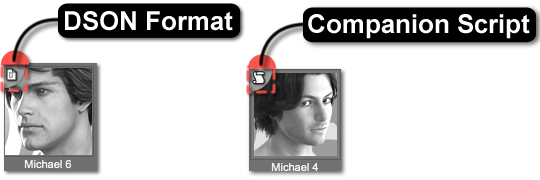
A Companion File is a file in a native format, which is named identically to an asset of an imported file type1), that resides in the same folder on disk as the asset file it is a companion for, with the exception of file extension. Companion files can exist in the form of a native script (.dsa, .dsb, .dse) or a DSON format asset (.duf); however, an asset is only allowed to have one companion file. If a native script and a DSON file both exist within the folder of an asset of an imported type, preference is given to the native script2).
Companion scripts typically contain conditional logic that must be evaluated and can be used to present options to the user or make decisions based on the state of the application, the contents of the scene, node selection states, etc. DSON format assets do not contain complex logic and their data can simply be loaded in a native way instead of executed.
Content Type
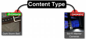 The Content Type of an asset is represented by a label and a color:
- Green - indicates that the asset adds an object to the scene; most wearable assets, like clothing, are green
- Yellow - suggests that the asset alters something about the selected object(s) in the scene, such as the materials or the pose of a figure
- Blue - indicates that the asset can add an object to the scene, or it can alter something about the selected object(s) in the scene, depending on the response to a choice made in a popup dialog or stored in preferences
- Red - signifies that the asset replaces something in the scene, such as lights or cameras, or even the entire scene itself
Native format assets typically offer options that change the loading behavior of the asset. See Control-Freak for more information.
Group
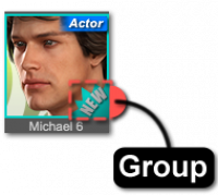
Assigning a Group to an item marks that item using colors and/or shapes and serves to establish user-definable collections or associations—much like using a highlighter on a page in a book or attaching stickers to objects in a room to draw attention to some form of relationship between the marked passages/items. By default, the application provides two distinct groups: None and New.
The list of available groups is designed to be extensible by end users but has a few rules that must be followed:
- Each custom group must consist of a pair of identically named PNG files that must exist on disk—one for assets, and one for products.
- Each pair of PNG files must follow the naming pattern id.label.png, where id is a unique positive numeric identifier for the group and label is the text that appears within the “Group As” sub-menu of the context menu for an item.
- Negative numeric identifiers are reserved for the application. (e.g., “New” = -1)
- These identically named PNG files must be placed in specific parallel folders of the application installation—i.e., ./resources/images/groups/assets and ./resources/images/groups/products.
- Once Group Asset As > New is selected from the context menu, the asset will no longer maintain a New group marking since it is no longer classified as “new.”
Regardless of their respective sizes, the PNG images will overlay and be anchored to the bottom right corner of the icon of the item to which they are assigned.
Note: Groups are currently only added to the menu when the application launches. This may change in a future version.
Label
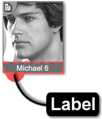
The Label is the word or phrase displayed directly beneath the icon, like Michael 6. In the case of a product, the label is typically the name of the product or a subset thereof. In the case of an asset, the label is typically descriptive of what the asset is and can often include what side of the body it was created for, if the asset is a prop and/or some pattern that signifies membership in a collection. For instance, a dagger prop label might state “left” in the label to indicate it was designed for the left hand of a figure.
Context Menu
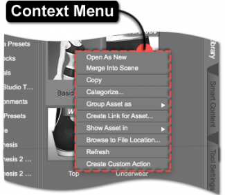
Right-clicking on an asset displays a context menu of options relating to that asset (or the set of selected assets). These options include:
- Open As New clears the current scene and loads the asset into a new scene.
- Merge Into Scene loads the asset directly into the current scene.
- Copy duplicates the selected asset to be pasted in another location.
- Categorize… displays the “Categorize” dialog. See managing_categories for more information.
- Group Asset as > displays a sub-menu with options for where to show the asset.
- New assigns the asset to the New group.
- None removes the asset from any group that it is currently assigned to.
- <User-Created> assigns the asset to the <User-Created> group. See Group for more information on how to create additional groups.
- Create Link for Asset… creates a link for the selected asset.
- Create Product from… prompts for the name of a product and either creates a new product containing copies of the assets selected using the name given or adds a copy of the selected assets to a product with the same name.
- Show Asset in > displays a sub-menu with options for where to show the asset.
- Smart Content > Files shows where the asset is located within the Files Page of the Smart Content pane. If multiple assets are selected, an attempt is made to select the deepest category path that is common to all of the selected assets.
- Smart Content > Products shows where the product that provides the asset is located within the Products Page of the Smart Content pane. If a single asset is selected, the Product Contents View for the product that provides the asset will be displayed. If multiple assets are selected, an attempt is made to select the deepest category path that is common to all of the selected assets.
- —
- Mapped Folder shows where the asset is located within the mapped folder structure of the Content Library pane.
- Products shows where the asset is located within the list of Products in the Content Library pane.
- Browse to File Location… opens the folder for the file that the selected asset represents in the native OS file browser (Windows Explorer/Finder).
- Refresh reloads the Asset View to reveal any additions and/or changes.
- Create Custom Action creates a custom_action (i.e., a script that loads the file referenced by the asset) in the Scripts menu on the Main Menu Bar.
Actions Bar
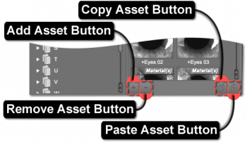
Add Asset Button
The Add Asset Button provides convenient access to saving a preset or scene to the current container; the same actions are available from the File > Save As menu in the Main Menu Bar. Clicking the button causes a File Save dialog to be displayed and provides the option to choose the name and location for the asset. If the selected container is a folder, the dialog will already have been navigated to the path of that folder on disk. If the selected container is a Category, the dialog will have been navigated to a predefined path based on the type of asset being saved.
If the selected container is a virtual_folder, a Product or any of the other intermediate container types, this button will be disabled.
Remove Asset Button
The Remove Asset Button removes the current selection from the current container.
Copy Asset Button
The Copy Asset Button copies the selected asset.
Paste Asset Button
The Paste Asset Button pastes a copied asset into the selected container.
