Sidebar
Results View (General)
The Results View displays the items filtered by the selected category in the Category View (General) and optionally the keyword(s) entered into the Filter Field. Double-clicking an Asset icon will add (or apply) it to the scene. Double-clicking a Product icon will cause the view to change so that the assets within that product are displayed.
The Results View in the Smart Content pane is very similar to the Results View in the Content Library pane in the way that the individual assets are displayed and decorated. One of the more significant differences between the two, however, is that the Smart Content pane is designed to filter and the Content Library pane is designed to search.
Filtering operates on the premise that, given a complete list, items that do not match a specified criteria are removed from the list.
Searching operates on the premise that, given an empty list, items that match a specified criteria are added to the list.
Filter Bar
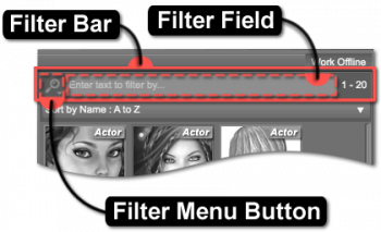
This area of the view provides options for filtering items based on a specific keyword, or set of keywords; clearing any keywords that may have been entered; accessing and managing saved filters; and displaying information about the number of matching results as well as a busy status.
Filter Menu Button
The Filter Menu Button provides consistent and convenient access to a menu populated with actions that pertain specifically to the text entered into the Filter Field. Clicking the button causes the Filter Menu to display.
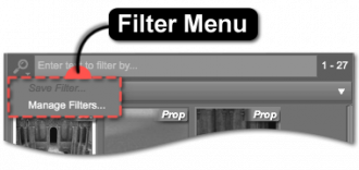
Filter Menu
The Filter Menu provides access to installed and/or user-created filters, along with the actions that provide access to saving and/or managing custom filters.
Clicking a Filter in the Filter Menu replaces the contents of the Filter Field with the text of that filter.
Clicking the Save Filter… action, near the bottom of the Filter Menu, causes a “Save Filter” dialog to be displayed.
Save Filter
The Save Filter dialog provides options for defining the Menu Path, as well as the Filter Name. The selector at the end of the Menu Path field is populated by any existing menu paths. Selecting a path from the list will replace the contents of the Menu Path field with the chosen value. The Filter Name field provides the ability to name the filter—the value of which must not contain characters that are not permitted, by the operating system, within file names. Once a valid Filter Name has been entered, the Accept button becomes enabled. Clicking the Accept button causes the dialog to disappear and the word or phrase entered into the Filter Field to be saved as an option in the Filter Menu for future use.
Manage Filters
The Manage Filters… action is used to launch an OS file browser window and opens to the folder that user-created filters are stored in. Which folder is opened depends on the type of items represented by the associated view.
The structure of the folders and files that reside within this folder directly correspond to the menus and filters displayed in the Filter Menu. Each page and/or pane uses a different set of filters, depending on the type of item represented by the associated view. These filter sets are stored in folders that exist parallel to the opened folder. As changes are made to the structure and/or contents of these folders, the same changes are automatically reflected in the Filter Menu the next time it is shown.
Filter Field
Entering a keyword into the Filter Field reduces the list of items to display. For instance, inserting the word “sword” into the field causes a search for items with the keyword “sword” associated with them and then displays only those items in the Results View.
Insert brief description and link to Advanced Filtering (e.g., Advanced Filtering).
Clear Filter
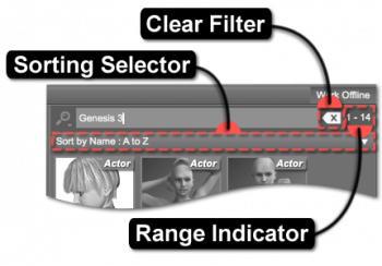
The Clear Filter button clears any keywords entered into the Filter Field. Note that this option only appears when text has been entered into the Filter Field.
Range Indicator
The Range Indicator displays how many items meet a specific criteria. For instance, if the selected category has nine results in it, the indicator would display 1–9. Similarly, if a keyword were then entered into the Filter Field, and only four of the results had that keyword associated with them, 1–4 would be displayed instead.
When a different category is selected in the Category View, the range changes to display how many items are associated with that specific category—the same applies to changing which keyword is entered into the Filter Field. If no results meet the current criteria, or no criteria has been defined—i.e., no category is selected—the indicator will display 0–0.
Progress Indicator
The Progress Indicator shows the status of a query into the content database. This indicator only becomes visible when the application must filter through a large enough set of records in the database to find results. The indicator is animated to signify that the application is busy or “in progress” and not stalled.
Sorting Selector
Use the Sorting Selector to change the order that items are displayed in the Results View. Click the selector to display a list of sorting options, then choose an item in the list to reorder the displayed results.
The sort order options include:
Asset Sorting
- Sort By Name: A to Z
- Sort By Name: Z to A
- Sort By Product ID: Highest First
- Sort By Product ID: Lowest First
- Sort By Created Date: Recent First
- Sort By Created Date: Oldest First
- Sort By Install Date: Recent First
- Sort By Install Date: Oldest First
- Sort By Last Update: Recent First
- Sort By Last Update: Oldest First
- Sort By Group ID: Lowest First
- Sort By Group ID: Highest First
Product Sorting
- Sort By Name: A to Z
- Sort By Name: Z to A
- Sort By Product ID: Highest First
- Sort By Product ID: Lowest First
- Sort By Release Date: Recent First
- Sort By Release Date: Oldest First
- Sort By Order Date: Recent First
- Sort By Order Date: Oldest First
- Sort By Install Date: Recent First
- Sort By Install Date: Oldest First
- Sort By Last Update: Recent First
- Sort By Last Update: Oldest First
- Sort By Group ID: Lowest First
- Sort By Group ID: Highest First
Results
When viewing either the Files or Products page, the Results View on the right displays the results of what is selected and filtered for in the Category View on the left. For example, if the “Accessories” category is selected in the Category View, the results displayed are either assets that are accessories when the Files page is selected or products that contain assets that are accessories when the Products page is selected. Results are displayed as items that have an icon and a label. Asset icons are square, while product icons are rectangular.
Icon
Each item displays an image, referred to as its Icon, to aide in visually distinguishing one item from another. These icons are typically in PNG (Portable Network Graphics) format. An item lacking an icon displays a Notice indicator in place of an icon.
Asset icons are named identically to the file that the asset represents, with the exception of the file extension, and reside in the same folder on disk as the file. For an asset named Example.duf, its icon would be named Example.png or Example.duf.png. If the name of the icon does not include the extension of the corresponding file in its name (i.e., Example.png), that icon will be displayed for the assets of any files in the path that do not have icons with names that do include their respective extensions (i.e, Example.dsa). However, if the name of the icon does include the extension of the corresponding file in its name (i.e, Example.dsa.png), the asset for that file will use that icon.
Optionally, assets posses the ability to display an alternate icon in its Tool Tip when the cursor is hovered over the asset. If the file for an asset named Example.duf also has an icon named Example.tip.png, the tip icon will be displayed instead of the standard icon.
Notice
If an icon for an asset is missing, a triangle with an exclamation point (“!”) surrounded by a frame appears and signals that the image for that asset's icon could not be found on disk. This notice appears in the center of where the icon would normally be. When the file for an asset is missing, a notice will appear in the lower left corner of where the icon would normally be. In the event that both the icon and the file are missing, both notices will appear.
Group
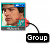
Assigning a Group to an item marks that item using colors and/or shapes and serves to establish user-definable collections or associations—much like using a highlighter on a page in a book or attaching stickers to objects in a room to draw attention to some form of relationship between the marked passages/items. By default, the application provides two distinct groups: None and New.
The list of available groups is designed to be extensible by end users but has a few rules that must be followed:
- Each custom group must consist of a pair of identically named PNG files that must exist on disk—one for assets, and one for products.
- Each pair of PNG files must follow the naming pattern id.label.png, where id is a unique positive numeric identifier for the group and label is the text that appears within the “Group As” sub-menu of the context menu for an item.
- Negative numeric identifiers are reserved for the application. (e.g., “New” = -1)
- These identically named PNG files must be placed in specific parallel folders of the application installation—i.e., ./resources/images/groups/assets and ./resources/images/groups/products.
Regardless of their respective sizes, the PNG images will overlay and be anchored to the bottom right corner of the icon of the item to which they are assigned.
Note: Groups are currently only added to the menu when the application launches. This may change in a future version.
Label
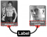
The Label is the word or phrase displayed directly beneath the icon, like Michael 6 or Genesis 2 Female Base. In the case of a product, the label is typically the name of the product or a subset thereof. In the case of an asset, the label is typically descriptive of what the asset is and can often include what side of the body it was created for and may also contain a pattern of characters that signifies membership in a collection. For instance, a dagger prop label might state “left” or “LHand” in the label to indicate it was designed for the left hand of a figure.
